Sunday 4 May 2014


Friday 11 April 2014
EVALUATION- Question 7 Looking back at my preliminary task, what do I feel I've learnt in the progression from it?

Although at the time I felt my preliminary task went ok I now look back
at it after doing the music magazine and realize that it is absolutely terrible.
I have learnt many skills using new software’s since then and learned more magazine
conventions which have made my magazine creating much better. Since
creating my school magazine my knowledge of using fireworks has increased
considerably allowing me to extend how high-quality my magazine can now be. For
example I now know how to put an image in front of some text whilst cutting the
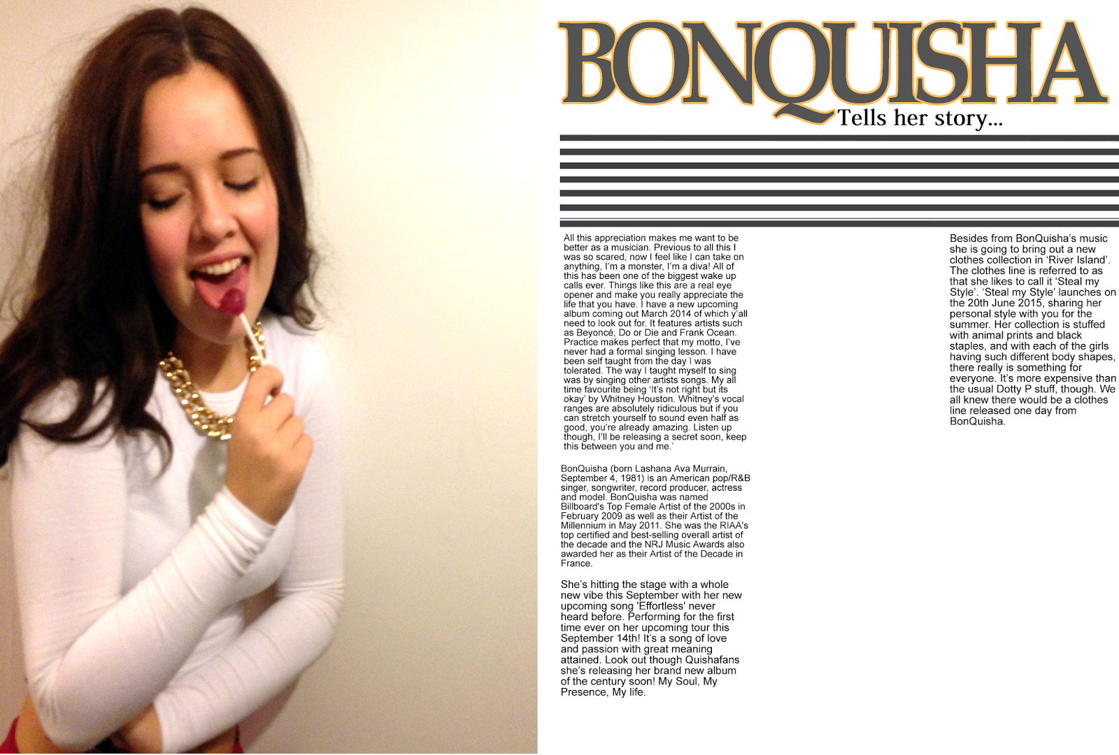
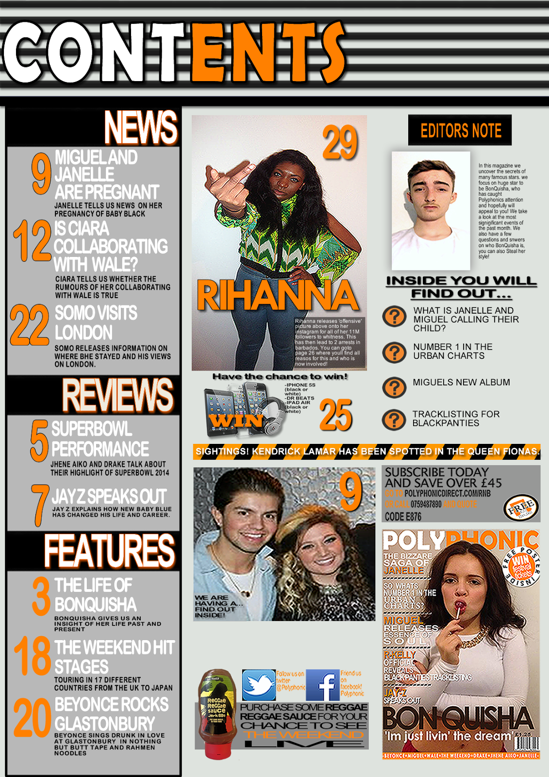
background out (BonQuisha on the front in front of polyphonic).
Overall my understanding of the software has improved greatly throughout this project because at the start I'd barely used fireworks and now I have produced a professional looking magazine using it.

Overall my understanding of the software has improved greatly throughout this project because at the start I'd barely used fireworks and now I have produced a professional looking magazine using it.
EVALUATION- Question 5 How did you attract/ address your target audience?
I attracted my target audience through many different
conventions of my magazine. My image on the front of my magazine of my model
using a mid shot was looking directly at the camera creating a connection
between the magazine and my audience. The colours I used on my magazine are eye
catching colours, and as my target audience are the younger generation I
decided I’d put orange on it as it comes across as a youthful colour, it also
goes well against both black and white. These chosen colours are also unisex
establishing the fact that the magazine is for any gender. I used a range of
different fonts throughout which could be classed as challenging the codes and conventions;
I did this as I want it all to be unique and not boring. I dressed my model in
similar clothing to what my target audience would wear creating more of a bond.
I used images of models aged the same as my target audience hopefully helping to
engage them with my magazine making them feel more comfortable. I put a pug on the cover inviting them inside
where there’s a free poster as many youths like to personalize their
environment at home with thing they enjoy- someone of age 60 wouldn’t be
interested in this. Although my magazine is more for the younger generation it isn’t
just dedicated to them. The simplicity of the magazine can draw many in to read
it, creating a wider audience and more income. I have used general, basic
language throughout my magazine making it not too complex for my younger target
audience to understand. Using complex language would immediately target an
older audience- that is not what I want.
EVALUATION- Question 4 Who would be the audience for your media product?
Young people in the media are
generally represented as being Immature, stupid, greedy, lazy, selfish, unfit,
obese, violent, callous, gullible, unreliable, careless, self-entitled and as though
never going to achieve anything. However my magazines model is a young female
who has aspired to be something great and has achieved it, this now goes
against all stereotypes of a young person in the media. Old people are shown in
the media as being grumpy, out-dated, slow, weak, whining,
unable to use technology, unhealthy, miserly, hard-of-hearing, ugly, never go
anywhere. My magazine doesn’t really mention any old people as my target
audience is young people so I’ve stuck to just using the younger generations of
16-39. My pose that I’ve had my model stand in is as though she’s got an attitude
and doesn’t really care about anyone else’s opinion on her, in many ways this
conforms to the stereotypes of young females but then it also transgresses as
most young girls are really bothered about their opinions they get of
themselves.
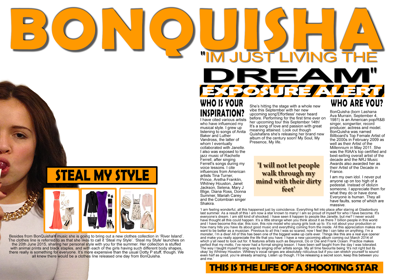
My Final Front Cover/ My Final Contents Page/ My Final Double Page Spread
 This is my front cover. My colour scheme consists of Orange Black White and the brown from my models hair. The visual syntax takes my audience over to my pug then directly down the front cover.
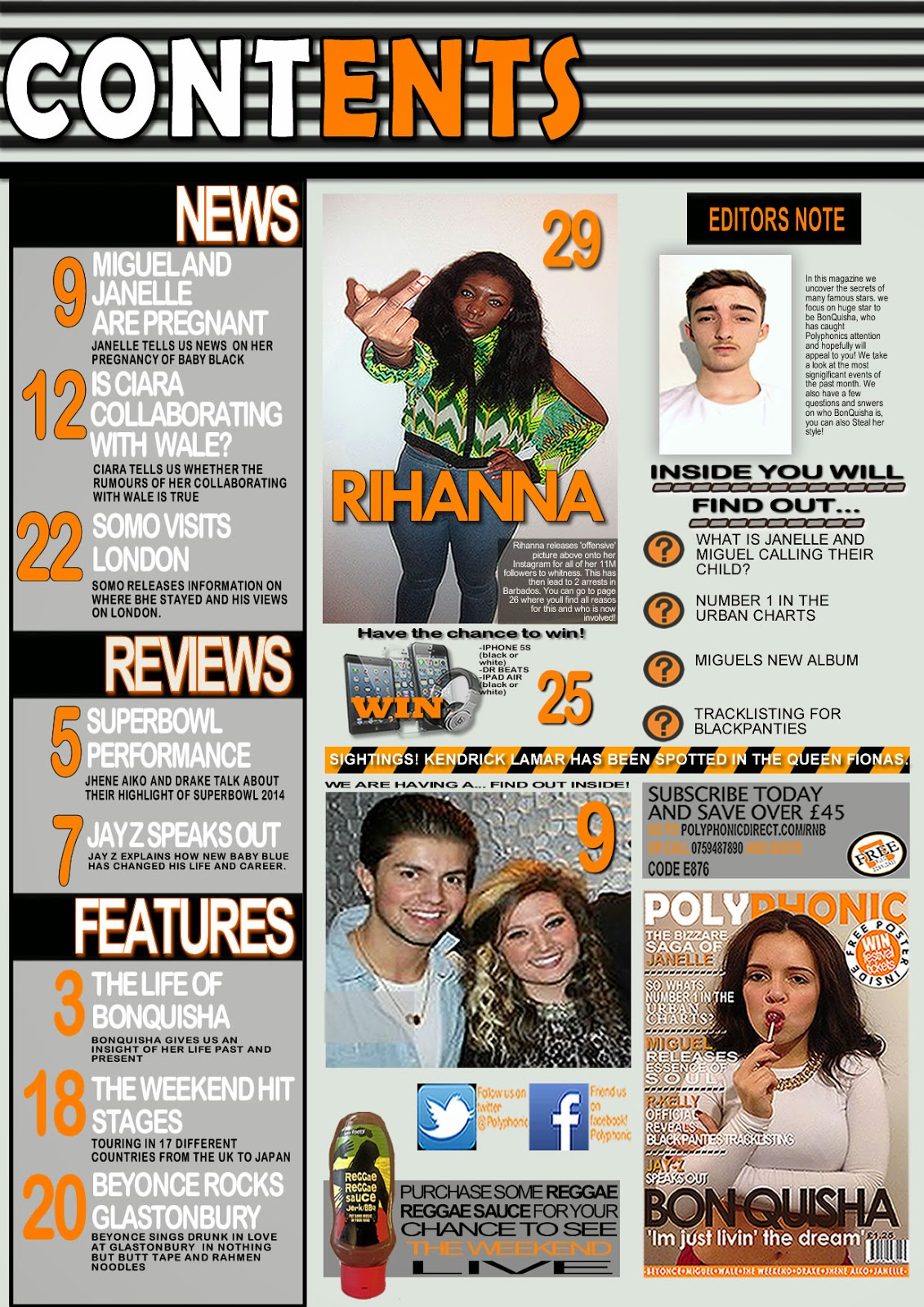

Tuesday 18 March 2014


Monday 10 February 2014
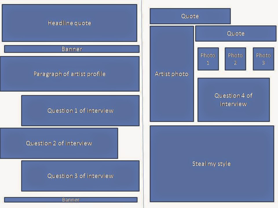
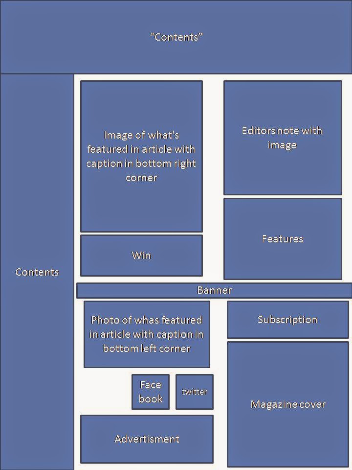
Contents Page Development
 I liked this idea at first but then changed my mind.
 1
1 2
2


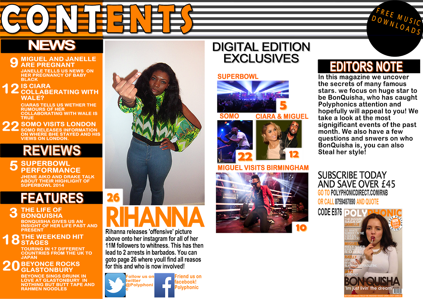
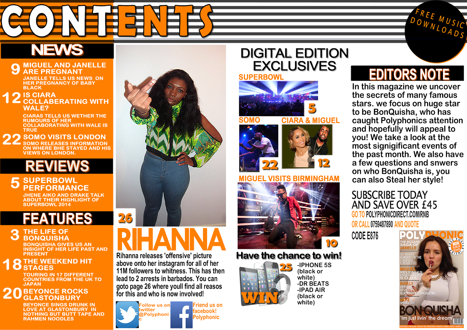


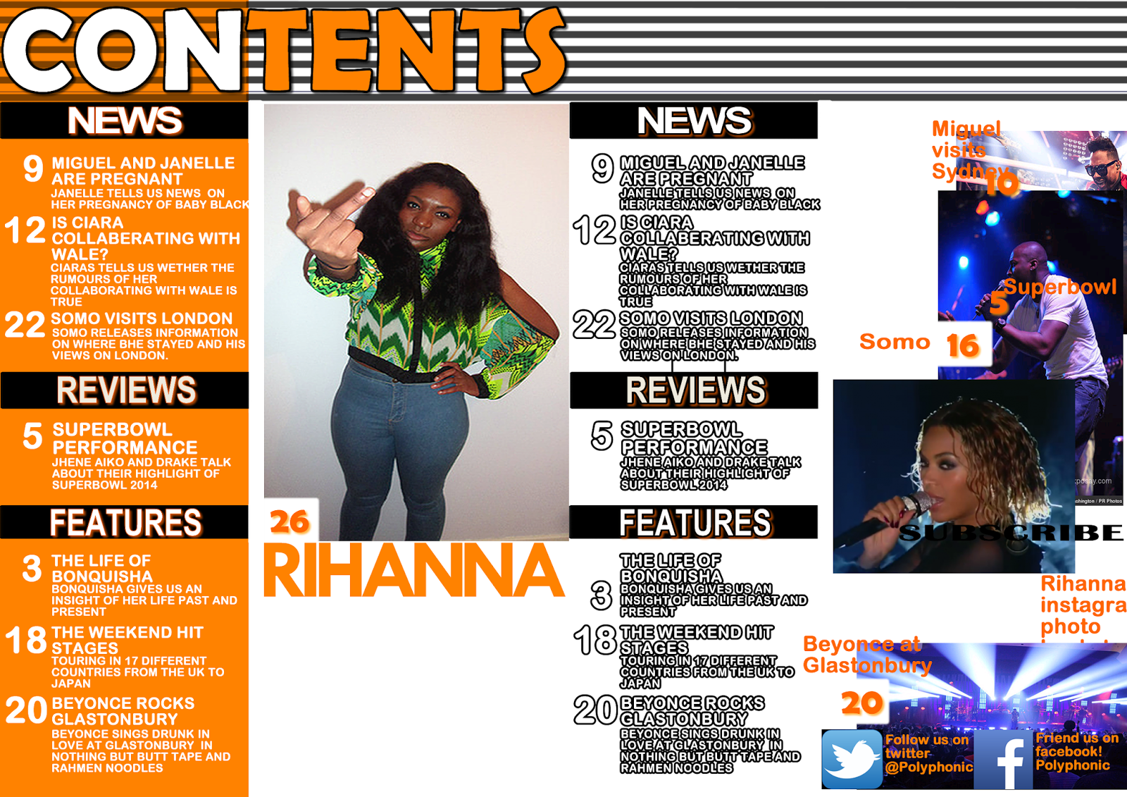

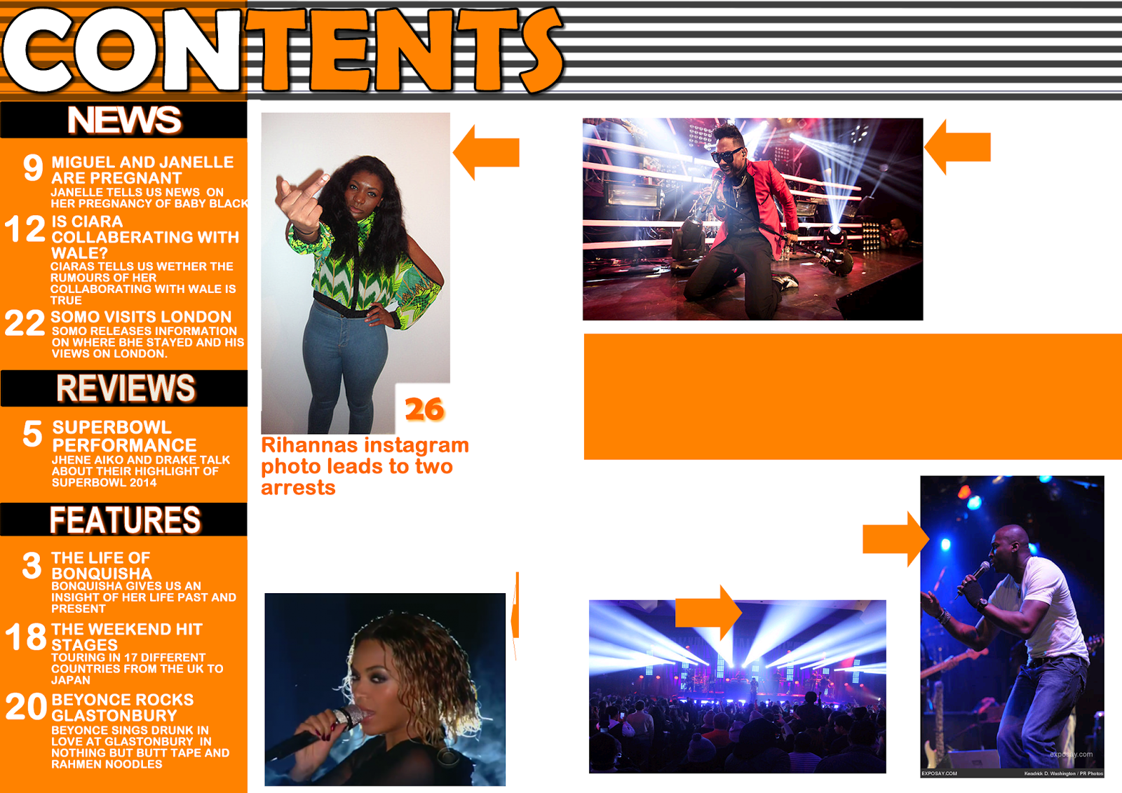


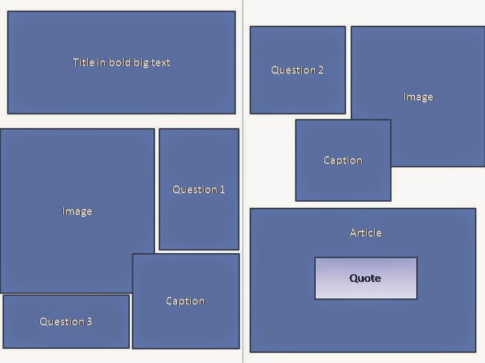
These are all my double paged contents pages but i struggled a little to fill the space so then decided id just do a single paged contents page.

Subscribe to:
Posts (Atom)